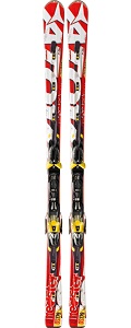
 Atomic Redster Doubledeck GS
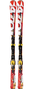 Atomic Redster Doubledeck SL
Although in this test I only had the chance to ski on two models, I had a very exciting experience. First, because both were models in the Race range and they couldn’t be more different from each other. One Slalom (SL) and one Giant Slalom (GS), both street models. Second, I had quite some time to test them, therefore I could dig deeper to see how and where they perforned best.
The brand has well understood the general public expectations with this kind of skis. Both perfectly comply with the “racing” standards as well as the specifications of each discipline. The only drawback can be found in the GS model, although its little deficiency is quite common on the rest of the other brands’ street GS models. Their turning radius are quite low and some of them (the Atomic Redster Doubledeck GS is no exception) have a slight tendency of even shortening them if they are pressed even with no intention.
And therein lies one of the dichotomies engineers try to choose in between when they are designing new models. A roundy ski that has little tendency to shorten the turn will delight the majority of users. Any action helping us accomplishing the turns will surely have a warm welcome. Although many try to ski perfectly applying the most correct technique, the majority commits little mistakes that are difficult to see in normal conditions, but are precisely the ones that stand out the most when the radius grows and the sidecut gets narrower. Then, the decision is clear for the engineers. However, those willing to dive into the GS discipline have their choices limited to a small number.
Aesthetically, the Atomic’s Race Range, aside from being dressed with the brand’s favourite colour (red), does it exaggeratedly. The top models, except those dedicated to the brand’s endorsers, are painted in a very striking red covered by the brand’s name in white. The letters are quite large and it looks like if there wasn’t enough ski for them.
The general looks are less crowded compared to older designs resulting in a cleaner aspect. The big problem comes with the chosen typography for the word “redster”, which is located in the back and gives the model its name. It reminds us a snack’s brand. And even though they don’t resemble each other a lot when put side by side, the sensation is still there, specially as the bit next to that area is painted in yellow (where the size and discipline are indicated). All in all, the end result is a design that reminds us a snack’s plastic wrap. Something quite remarkable, I would say.
To conclude, Atomic has created two top models on the Race range that will please immensely those expert skiers willing to enjoy the racing taste, for their appearance, their touch and the physical and technical demands, without the need to comply with the competition script.
© Copyright – All rights reserved