 Elan Race SLX Fusion (updated to 2014-2015)
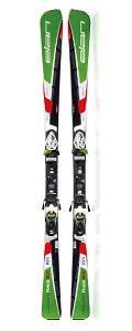
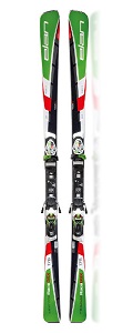 Elan Race GSX Fusion (updated to 2015-2015)
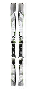 Elan Amphibio 14 Fusion (updated to 2014-2015)

Taking into account this manufacturer aspires to produce 10% of all skis in the world, one might expect to find a brand with a very good reputation behind. A trademark you can trust a hundred per cent. Clichés can betray you, and this one will with the test you’re about to read. The blame will fall on the GSX model, as you will see.
One common characteristic of the three models tested is their lightness. Of course there are differences of weight between them, but you’ll feel them light in your hands. A fact that will be more remarkable when compared to handmade racing skis of each kind. This lightness is also noticed when you step on them, although the Waveflex 14 is the lightest of the three.
Aesthetically, they are greener than they were the last season. Their tone is a bit deeper and the color sees its leading role increased. The drawing in the SLX and the GSX reinforces the asymmetric concept proposed by Elan, breaking the grid design from last season. Noteworthy is the printing of the words “Left” and “Right” put on purpose for making stepping in easier without being confused of which one should be worn on each foot, if the shape of the shovels still hasn’t warned us. Although the more rebellious will always have the chance to wear the chosen ski (obviously countering the left-right instructions) in the foot they want without a hassle. (Dyslexics can do it too).
The Waveflex 14’s sin is being so whitewashed. Too much. The snow is white enough as to wear a white ski. It’s worth mentioning that Kästle has also done the same thing for several seasons in the recent past. However, if we focus on the Waveflex 14’s behavior, we will forget this issue immediately.
Personally, I have to admit my particular aesthetic taste doesn’t fall in between what is commonly accepted as looking good or bad. Therefore, Elan suffers under my judgement. Elan’s interpretation of the “back to the eighties” (even seventies) trend that fashion gurus are leading nowadays, doesn’t convince me at all. In general, they are ugly (except the Mountain range models) although they don’t qualify for harming the sight. As said before, there’s too much green in the green models. Joined by some black parts, it produces a fly-like (meaning the insect) effect. Elan has always related itself to green color. If we take a look to what marketing parameters say about green, there is a good reason to do so. “The green color is often associated to nature (obvious), to harmony, growth and safety.”
The models in the Mountain range follow the asymmetric pattern too, but with a combination of colors and elements (the thin stripe in the shovel) that contribute to a more quality and freedom (in the design) perception. And it is in here where Elan has hit the target when interpreting the “new” retro-style. Nothing comparable to the amazing horror seen in this range on last season.
© Copyright – All rights reserved